

The Fundamentals of Branding and Why They Matter
Branding is essential to making your business stand out as a unique and recognizable entity. It not only helps cement yourself in the minds of your customers and clients, but it can also help you manage how your financial institution is perceived by the outside world, with elements representing your mission, brand personality, and aims for your customers’ experience.
When you develop your brand, you create a distinctive and memorable identity using a combination of visual elements (like logos and typography) and ideological elements (like slogans and brand voice or tone). Oftentimes, businesses will even use items like mascots and other symbols to represent both, humanizing the brand while embodying its values and personality.
Color is an important linchpin in good branding design. It can immediately evoke emotional connotations for your audience, adds a seamless element of distinction, and can be an elegant solution to unifying your visual presentation. In this post we’ll explain how, exploring the basics of color psychology in marketing—from how to choose the best colors for your business logo to incorporating color across platforms for a consistent user experience. Keep reading to learn more!

How Color Helps Bring Your Brand to Life
Color is perhaps the first thing your audience perceives when they look at your logos or think about your brand. It requires little mental processing, yet can trigger instant associations, from unconscious emotional responses to trained connections. There are entire fields of study devoted to understanding the effect of color on the viewer (and how these effects can be harnessed!).
So, what feelings can different colors call forth? Let’s take a look at some of the most common emotional color associations to better understand how you might utilize color psychology in branding:
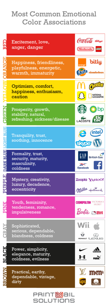
As you can see, each color has positive and negative associations. By pairing the right colors, you can effectively temper negative associations or build upon those positive ones. For instance, the instantly recognizable pairing of red and yellow for many fast-food chains allows yellow, associated with happiness and comfort, to minimize the stronger negative associations of red (while also playing with common food color palettes). Alternatively, coupling shades of blue and green in a healthcare setting can amplify feelings of calmness, trust, and security. However, it’s important to note that perceptions of color can vary across personal experiences, industries, cultures, and even ages. Always know your audience!
The Key Benefits of a Color-Driven Branding Strategy
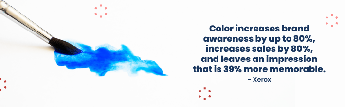
Color is crucial in business branding. It enhances brand recognition and communicates a brand’s personality, helping to create a strong, memorable, and managed visual identity. So, how does color achieve these results?
Color helps you maintain a consistent brand image. Across platforms, media, and campaigns, color can unify your image to provide a seamless omni-channel customer experience. Choose a distinct shade, use it with regularity, and you can instantly increase brand cohesion.
Color can positively influence consumer sentiment about your brand. As we discussed above, selecting the right color or color combination can help you take advantage of pre-existing emotional associations, like trust, stability, security, and warmth. Consider your core values and select colors that reflect these.
Color can differentiate you from your competitors. Choosing a unique palette can create instant distinction, setting you apart from the competition and leading to increased recognition within communities served. Research similar brands and consider how your branding can stand out, while still preserving successful and essential industry elements.
How to Boost Your Financial Brand Using Color
Whether you are just developing your brand’s palette or have an established and effective color strategy in place, it’s important to take stock of all the ways you can use color within and across media to avoid missing opportunities to capitalize on your design. Let’s take a look at a few areas you won’t want to overlook.
Routine customer communications. While it may seem cost-effective to go gray-scale with certain communications, every interaction with your customers is an opportunity to solidify your brand. From e-statements and in-app notifications to paper statements, regular communications should align with your branding—including your use of color. Full-color logos, slogans, and standard design elements, as well as consistent use of color throughout your communications, can make a big impact in identity-management for your current customer base.
Digital media. From website design to digital ads and social media, those pops of color that align with your logo and overall brand strategy will create a cohesive user experience that can standardize your brand’s voice and build recognition beyond your current customer base. Remember: as part of any successful rebranding strategy, it’s essential to update all touchpoints across platforms.
Physical marketing materials. All physical marketing materials, including brochures, newsletters, holiday cards, and product pamphlets are a chance to underscore your brand, expanding its reach and recognition—and color is just one element of design that can enhance your potential customers’ perceptions of quality. Don’t forget other promotional materials including business cards, pens, and water bottles!
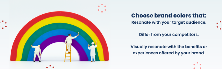
Choosing the Right Color Palette
Is your initial branding still underway? Are you looking to rebrand? Here are some questions to consider to help you home in on the right hues.
- What do you want your brand to communicate to your customers?
Consider the feelings you want your customers to associate with your financial institution or company, as well as the core values that you want to convey.
- How can you differentiate your brand from your competitors?
Many financial institutions and professional services utilize similar color schemes in an attempt to project the same kinds of emotional qualities—trustworthiness, stability, reliability, safety, and even warmth and comfort. Consider how you can emanate these same sentiments while setting yourself apart by playing with different shades and secondary colors.
- How will your brand’s colors relate to your target audience?
Age, gender, socioeconomics, marital status, and geography can all influence how customers react to color as well as what a customer may seek from your services. Whether your target audience involves a broad swath of customers or a narrow, targeted group, consider how to best appeal to them via color.
Let’s consider an example:
A rural bank that serves an agricultural community is rebranding. They want to communicate prosperity and stability, appeal to farmers, and set themselves apart from other local banks that often rely on blues for their color schemes. They decided to choose green for their new logo to meet all these branding goals.
Not sure where to begin with your branding or rebranding process? Lean on the advice of experts to ensure you are carving the right path for your financial institution.
Partner with PrintMail Solutions to Drive Growth for Your Financial Institution
Color is just one component of brand design—but the proper use can be a pivotal driver for your branding efforts. Looking to do more with color at your bank or credit union? PrintMail can help!
Embrace a color-driven branding approach to effectively achieve superior customer messaging. From financial statements to marketing materials, our color printing services can help your brand pop. Contact PrintMail Solutions today to explore color statement options for your financial institution and receive a personalized strategy consultation from one of our brand management experts.
Found this article helpful? Subscribe to our blog for additional bank and credit union marketing techniques and tips.